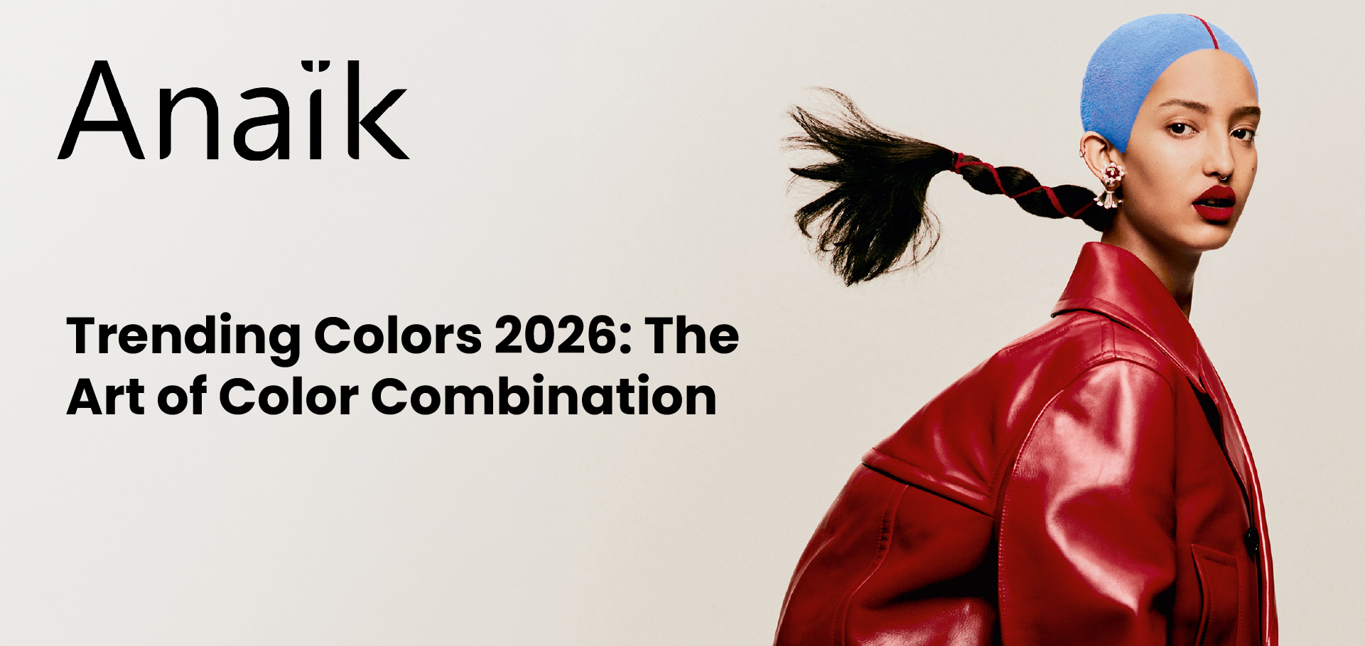
Trending Colors for 2026: The Art of Color Combinations
Color combinations designed to enhance your collections.
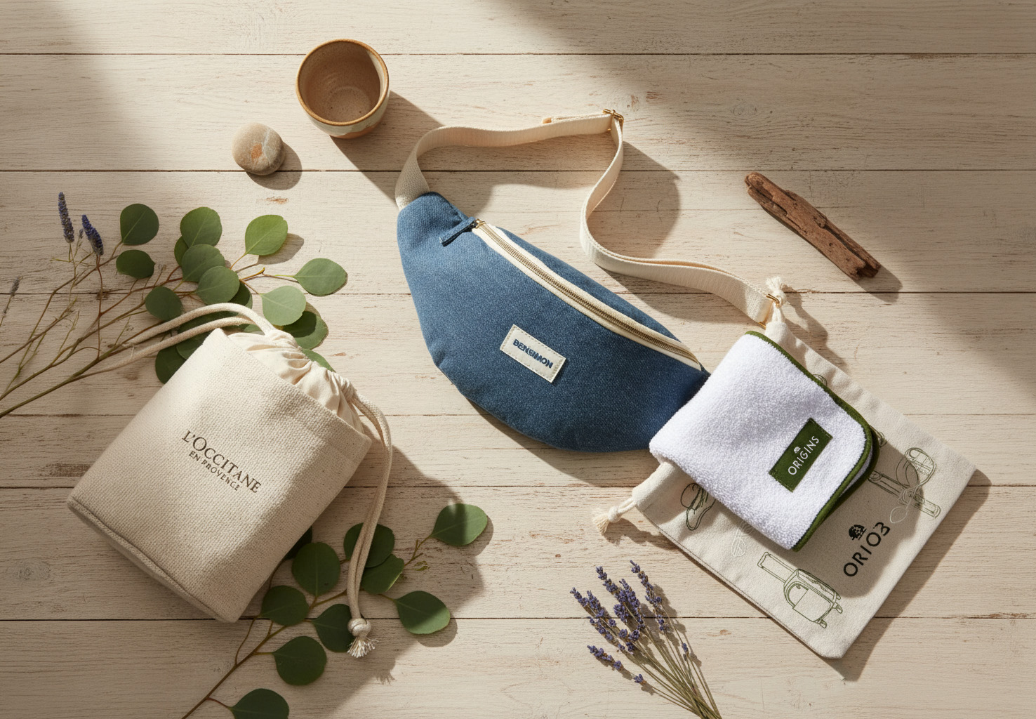
Pouches, bags, accessories, or packaging: each combination is tailored to its intended use and fits seamlessly into a cohesive brand identity. In 2026, color emerges from the interplay of hues, highlighting materials and giving structure to objects.
This approach allows for the creation of harmonious ensembles, where every nuance contributes to the overall balance.
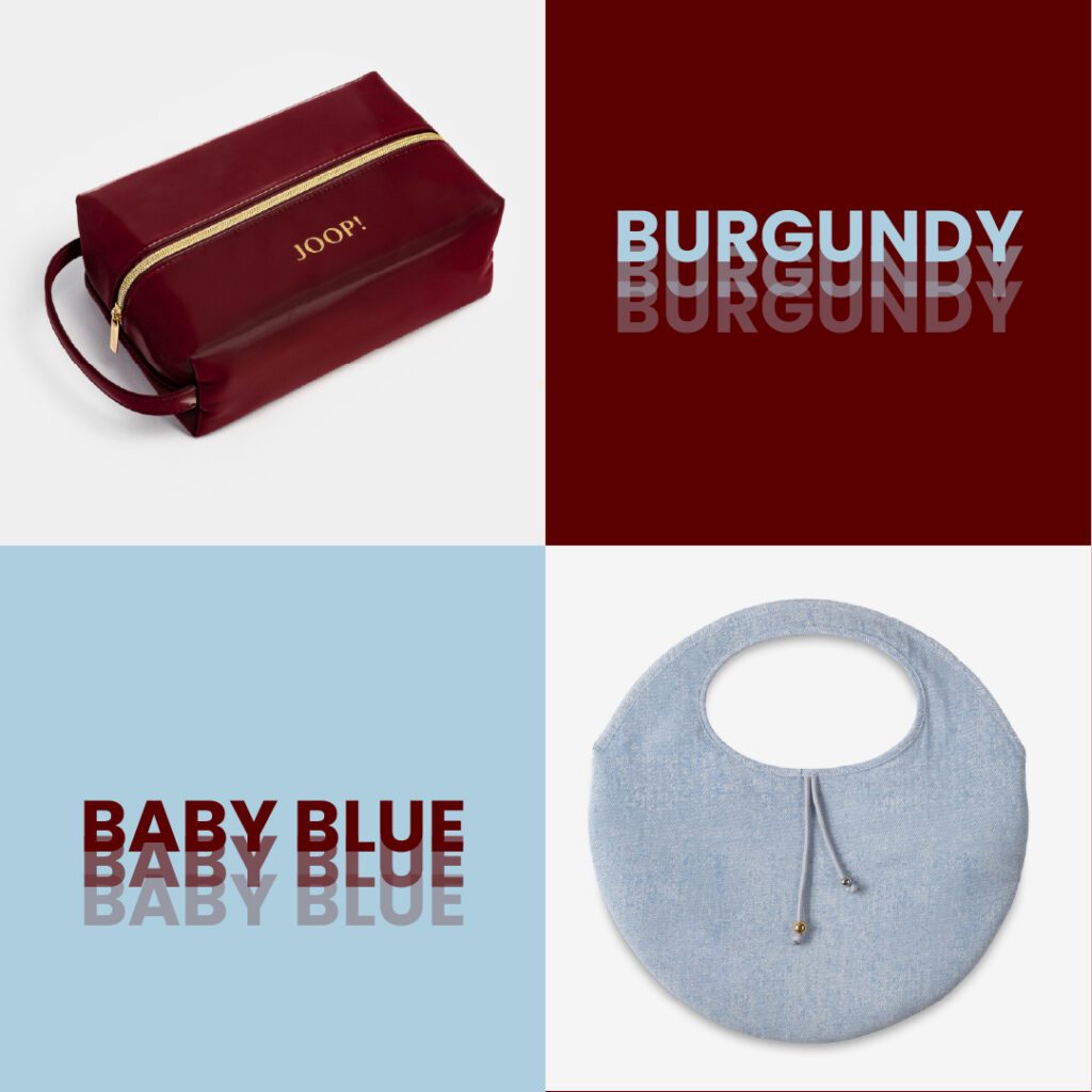
Baby Blue × Burgundy
The softness of baby blue meets the depth of burgundy in a balanced combination. This color scheme creates a harmonious contrast, where the cool tone tempers the intensity of the deep red.
It is particularly well-suited for printed materials and textile accessories, where the interplay of textures enhances the visual impact of the colors.
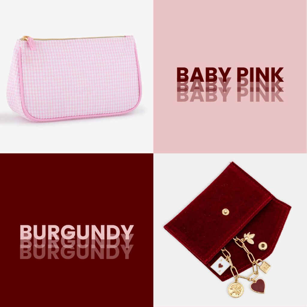
Burgundy × Baby Pink
The rich, full-bodied burgundy takes on subtle nuances when paired with baby pink. The combination feels lighter without losing any of its character.
This harmony is best suited to items where visual balance is key: pouches, gift sets, or lifestyle accessories.
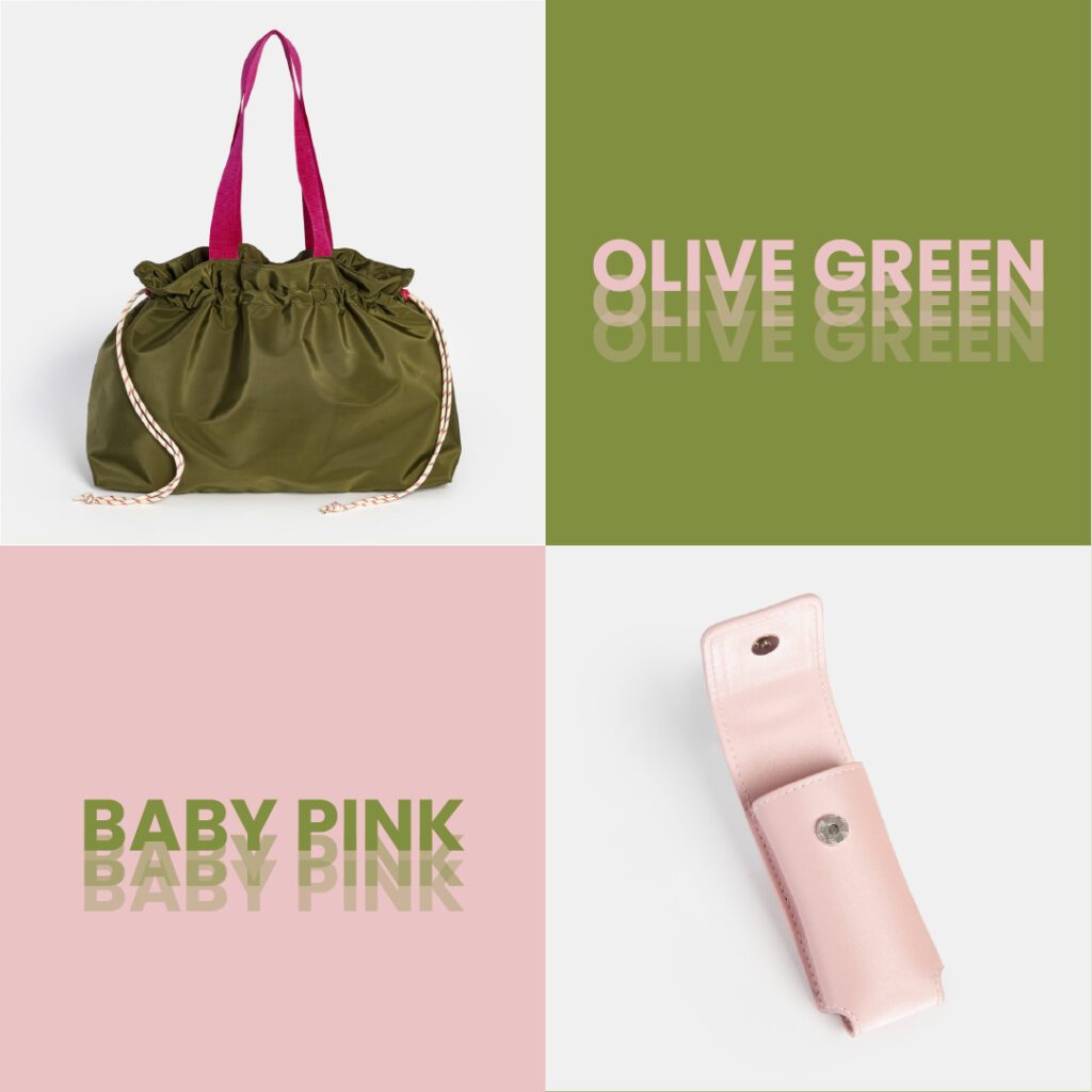
Baby Pink × Olive Green
Baby pink pairs with olive green to create a palette inspired by natural tones. One brings light, while the other adds a more organic feel.
This jumpsuit fits naturally into everyday-wear collections, where fabric and durability take center stage.
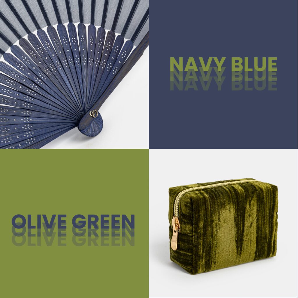
Olive Green × Navy Blue
Olive green adds a vibrant touch, which navy blue helps to balance. The combination gains depth and stability.
It is particularly well-suited for functional objects or durable collections, where understated design complements their practical use.
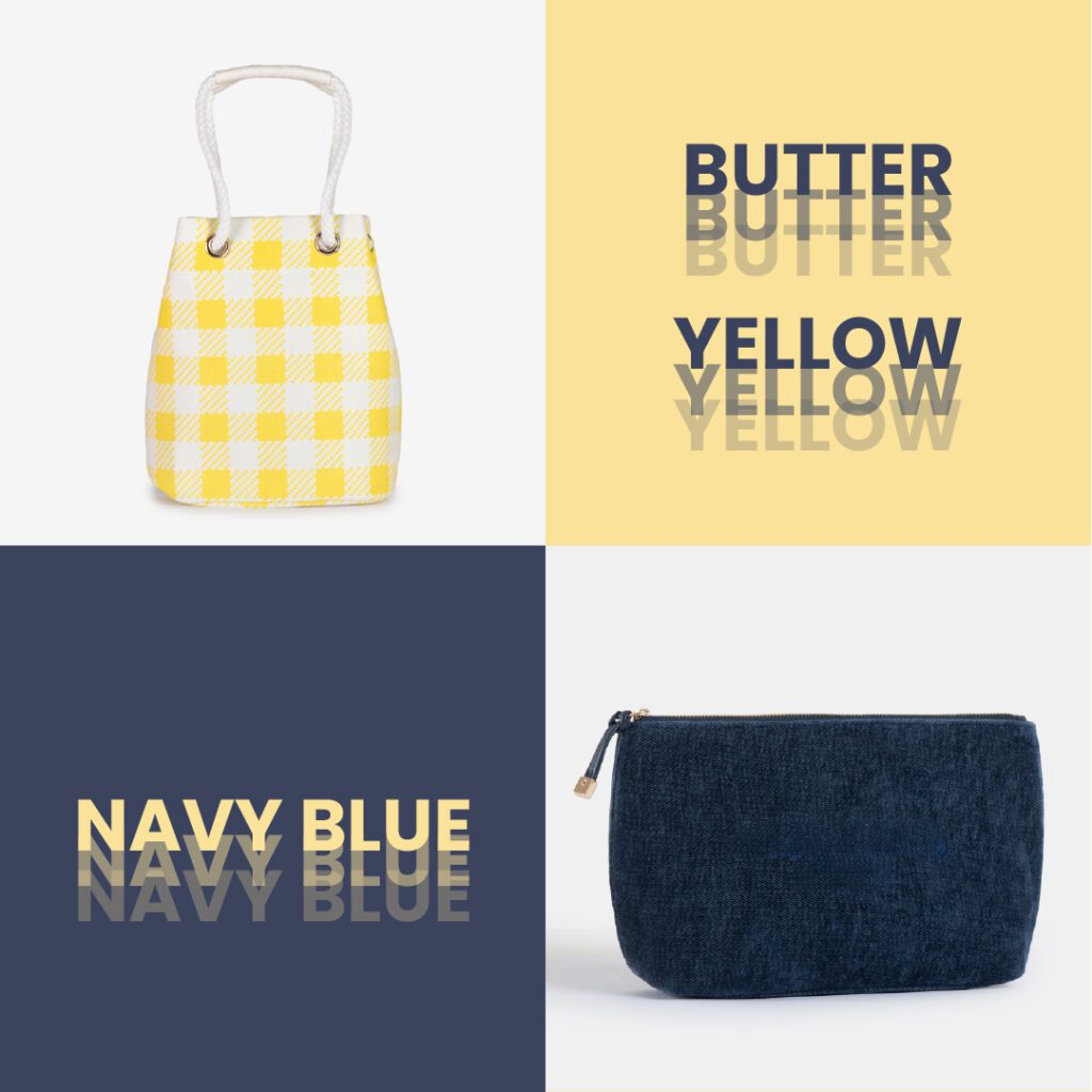
Navy Blue × Butter Yellow
The richness of the navy blue brings out the softness of the butter yellow. This subtle contrast enhances clarity while maintaining a sense of restraint.
This color palette works particularly well on objects that are meant to be seen, while still remaining consistent with the overall theme.
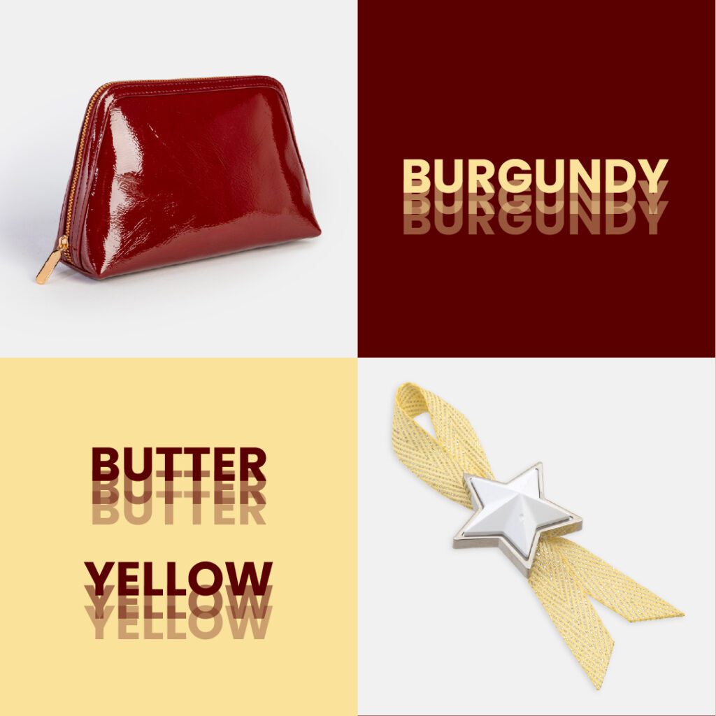
Butter Yellow × Burgundy
Butter yellow brightens the richness of burgundy, creating a warm and structured combination. The balance stems from the yellow’s ability to soften the depth of the red.
It lends itself naturally to items with an event-based or seasonal theme, where color is part of the experience.
Conclusion
Color combinations designed to enhance your collections.
Whether applied to pencil cases, bags, accessories, or packaging, these color schemes adapt to every project and help build a cohesive and enduring brand identity.
At Anaïk, each combination is viewed as a creative tool, used to craft pieces designed with consistency and precision.
Founded in 1973 in Roubaix, Anaïk is a leading designer and supplier of gifts, packaging and accessories for major international brands and retailers. Its head office is located in Villeneuve d'Ascq (59). Committed to CSR, Anaïk has been integrating it into its strategies for over 18 years, becoming an expert in eco-design.